- Fix bold helper classes that were broken because of CSS syntax error
- Refined the repo list CSS and layout
- Removing bold
- Downsize the mirror icon to fit
- Fix icon positions
- Adapted the org list to match
- Center the '+' icon and mute it

<img width="385" alt="Screenshot 2023-05-25 at 18 38 31"
src="ac8d6efb-5751-4845-a4ab-db1ddaf36ec3">
<img width="384" alt="Screenshot 2023-05-25 at 18 30 29"
src="bbd39ae7-da9d-4c6f-bfe3-42f28b7a74c3">
- Replace `<table>` with flexbox
- Add issue modification time and issue number
- Remove big title
- Replace tabs with menu items
- Add clicked item deletion on back button cache restoration

---------

Co-authored-by: wxiaoguang <wxiaoguang@gmail.com>
There was some recent discussion about this in Discord `ui-design`
channel and the conclusion was that
https://github.com/go-gitea/gitea/issues/24305 should have fixed their
OS font installation to have semibold weights.

I have now tested this 601 weight on a Windows 10 machine on Firefox
myself, and I immediately noticed that bold was excessivly bold and
rendering as 700 because browsers are biased towards bolder fonts. So
revert this back to the previous value.
Was only an issue on arc-green:

### Before
<img width="313" alt="Screenshot 2023-05-17 at 23 33 15"
src="0f6916c6-c6c3-43c8-84cc-24b0a9800a43">

### After
<img width="310" alt="Screenshot 2023-05-17 at 23 32 52"
src="207d3d7f-ce6f-4170-b426-e743be760185">

Co-authored-by: Giteabot <teabot@gitea.io>
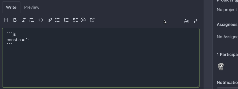
- Make code block rendering via backticks work
- Remove link color unless hovered
- Remove table stripes and fix stripes rendering on dark theme for other
tables
- Introduce new `button-link` class discussed previously for buttons
that look and act like links and apply it to the two right-side buttons
- Reduce box padding by 8px on each side
- Fix "Mark all read" button margin-right
- brighten `--color-markup-code-block` on arc-green

### Before
<img width="1216" alt="Screenshot 2023-05-10 at 20 00 30"
src="66da9ec2-dd09-4ef0-8f1d-1822a18b6b43">
<img width="1211" alt="Screenshot 2023-05-10 at 20 00 48"
src="f48e30a2-9a00-4723-93aa-79b97ca0ba0c">

### After
<img width="1222" alt="Screenshot 2023-05-10 at 20 09 59"
src="c956e0d0-b3d9-42a4-a3ed-f0431c22bf3f">
<img width="1218" alt="Screenshot 2023-05-10 at 20 05 34"
src="f72c1628-3961-4c28-9263-07cdf7531316">
Close#24302
Part of #24229, Follows #24246
This PR focused on CSS style fine-tune, main changes:
1. Give `.ui.ui.ui.container` a width of `1280px` with a max-width of
`calc(100vw - 64px)`, so the main contents looks better on large
devices.
2. Share styles for table elements in all levels settings pages to fix
overflow of runners table on mobile and for consistency (The headers on
mobile can be further improved, but haven't found a proper way yet).
3. Use [stackable
grid](https://fomantic-ui.com/collections/grid.html#stackable) and
[device column width](https://fomantic-ui.com/examples/responsive.html)
for responsiveness for some pages (repo/org collaborators settings
pages, org teams related page)
4. Fixed#24302 by sharing label related CSS in reporg.css
5. Fine tune repo tags settings page
---------
Co-authored-by: wxiaoguang <wxiaoguang@gmail.com>
The _graceful_ should fail less when the `.editorconfig` file isn't
properly written, e.g. boolean values from YAML or unparseable numbers
(when a number is expected). As is... information is lost as the
_warning_ (a go-multierror.Error) is ignored. If anybody knows how to
send them to the UI as warning; any help is appreciated.
Closes#20694
Signed-off-by: Yoan Blanc <yoan@dosimple.ch>
Although it seems that some different purposes are mixed in this PR,
however, they are all related, and can be tested together, so I put them
together to save everyone's time.
Diff: `+79 −84`, everything becomes much better.
### Improve the dropdown settings.
Move all fomantic-init related code into our `fomantic.js`
Fine-tune some dropdown global settings, see the comments.
Also help to fix the first problem in #23625 , cc: @yp05327
The "language" menu has been simplified, and it works with small-height
window better.
### Use SVG instead of `<i class="delete icon">`
It's also done by `$.fn.dropdown.settings.templates.label` , cc:
@silverwind
### Remove incorrect `tabable` CSS class
It doesn't have CSS styles, and it was only in Vue. So it's totally
unnecessary, remove it by the way.
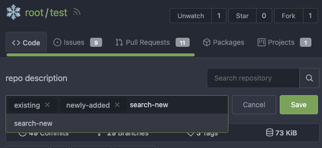
### Improve the Repo Topic Edit form
* Simplify the code
* Add a "Cancel" button
* Align elements
Before:
<details>
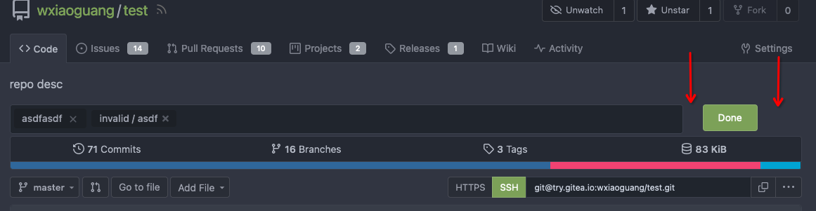
</details>
After:
Ran most of the Less files through the Less compiler and Prettier and
then followed up with a round of manual fixes.

The Less compiler had unfortunately stripped all `//` style comments
that I had to restore (It did preserve `/* */` comments). Other fixes
include duplicate selector removal which were revealed after the
transpilation and which weren't caught by stylelint before but now are.

Fixes: https://github.com/go-gitea/gitea/issues/15565