Part of https://github.com/go-gitea/gitea/issues/27097:

- `gitea` theme is renamed to `gitea-light`
- `arc-green` theme is renamed to `gitea-dark`
- `auto` theme is renamed to `gitea-auto`

I put both themes in separate CSS files, removing all colors from the
base CSS. Existing users will be migrated to the new theme names. The
dark theme recolor will follow in a separate PR.

## ⚠️ BREAKING ⚠️

1. If there are existing custom themes with the names `gitea-light` or
`gitea-dark`, rename them before this upgrade and update the `theme`
column in the `user` table for each affected user.
2. The theme in `<html>` has moved from `class="theme-name"` to
`data-theme="name"`, existing customizations that depend on should be
updated.

---------

Co-authored-by: Lunny Xiao <xiaolunwen@gmail.com>
Co-authored-by: Giteabot <teabot@gitea.io>
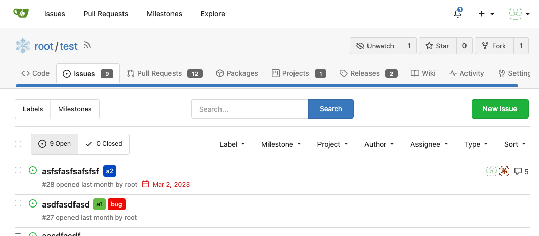
This PR refactors a bunch of projects-related code, mostly the
templates.
The following things were done:
- rename boards to columns in frontend code
- use the new `ctx.Locale.Tr` method
- cleanup template, remove useless newlines, classes, comments
- merge org-/user and repo level project template together
- move "new column" button into project toolbar
- move issue card (shared by projects and pinned issues) to shared
template, remove useless duplicated styles
- add search function to projects (to make the layout more similar to
milestones list where it is inherited from 😆)
- maybe more changes I forgot I've done 😆Closes#24893
After:


---------
Co-authored-by: silverwind <me@silverwind.io>
This PR introduces a new UI element type for Gitea called `flex-item`.
It consists of a horizontal card with a leading, main and trailing part:

The idea behind it is that in Gitea UI, we have many cases where we use
this kind of layout, but it is achieved in many different ways:
- grid layout
- `.ui.list` with additional hacky flexbox
- `.ui.key.list` - looks to me like a style set originally created for
ssh/gpg key list, was used in many other places
- `.issue.list` - created for issue cards, used in many other places
- ...
This new style is based on `.issue.list`, specifically the refactoring
of it done in #25750.
In this PR, the new element is introduced and lots of templates are
being refactored to use that style. This allows to remove a lot of
page-specific css, makes many of the elements responsive or simply
provides a cleaner/better-looking way to present information.
A devtest section with the new style is also available.
<details>
<summary>Screenshots (left: before, right: after)</summary>


</details>
---------
Co-authored-by: Giteabot <teabot@gitea.io>
Same as https://github.com/go-gitea/gitea/pull/26026 but for the user
settings page. It introduces a new `flex-container` class and shares it
across both pages.

Before and After:
<img width="1264" alt="Screenshot 2023-07-21 at 19 35 57"
src="1358dab4-55c0-40ce-a4d5-673099304f3d">
<img width="1269" alt="Screenshot 2023-07-21 at 19 35 42"
src="34812f6d-dc65-4009-b977-90e03efdc6d1">
This will prevent the most common cases of SVG shrinking because lack of
space. I evaluated multiple options and this seems to be the one with
the least impact in size and processing cost, so I went with it.

Unfortunately, CSS can not dynamically convert `16` obtained from
`attr()` to `16px`, or else a generic solution for all sizes would have
been possible. But a solution is [in
sight](https://developer.mozilla.org/en-US/docs/Web/CSS/attr#type-or-unit)
with `attr(width px)` but no browser supports it currently.
Should look exactly like before for normal dividers. "Horizontal" ones
look better because they no longer use image backgrounds.

<img width="917" alt="Screenshot 2023-06-27 at 19 07 56"
src="d97d8dec-6859-44a8-85ba-e4549b4dd9df">

<img width="914" alt="Screenshot 2023-06-27 at 19 05 58"
src="8bf98544-2d82-4ebf-ac68-d6dc237bd6b2">

<img width="1246" alt="Screenshot 2023-06-27 at 19 00 42"
src="36a6bb21-6029-4f53-8bee-535f55c66fed">

<img width="344" alt="Screenshot 2023-06-27 at 18 58 15"
src="a9e70aee-8e6b-4ea1-9e93-19c9f96aec6e">
<img width="823" alt="Screenshot 2023-06-27 at 18 56 22"
src="e7a497cd-f262-4683-8872-23c3c8cce32f">

<img width="330" alt="Screenshot 2023-06-27 at 19 21 11"
src="42f24149-a655-4c7e-bd26-8ab52db6446b">
Close#20976Close#20975
1. Fix the bug: the TOC in footer was incorrectly rendered as main
content's TOC
2. Fix the layout: on mobile, the TOC is put above the main content,
while the sidebar is put below the main content
3. Auto collapse the TOC on mobile
ps: many styles of "wiki.css" are moved from old css files, so leave
nits to following PRs.
- Extract navbar CSS to own file
- Reduce height from 52px to 50px
- Give every item a hover effect of of 36px, including the logo and on
mobile
- Consistent horizontal padding of 10px left and right

<img width="549" alt="Screenshot 2023-06-18 at 13 41 16"
src="0b00d101-253e-4b1f-9ee2-322d60fb2e26">

<img width="98" alt="Screenshot 2023-06-18 at 14 03 43"
src="4ef5d98b-4d1e-45de-822e-c2c844e19876">
<img width="234" alt="Screenshot 2023-06-18 at 14 03 18"
src="a4d9b04b-83de-42aa-a9ce-f010a9690688">

<img width="873" alt="Screenshot 2023-06-18 at 13 58 28"
src="8cb8e31e-2adf-40c8-ae3f-d00d011b4d1b">

---------

Co-authored-by: wxiaoguang <wxiaoguang@gmail.com>
Co-authored-by: Giteabot <teabot@gitea.io>
Various fixes to pages or elements which were looking ugly on mobile.
<details>
<summary>Screenshots</summary>


</details>
Co-authored by @silverwind
---------
Co-authored-by: silverwind <me@silverwind.io>
The current UI to create API access tokens uses checkboxes that have a
complicated relationship where some need to be checked and/or disabled
in certain states. It also requires that a user interact with it to
understand what their options really are.

This branch changes to use `<select>`s. It better fits the available
options, and it's closer to [GitHub's
UI](https://github.com/settings/personal-access-tokens/new), which is
good, in my opinion. It's more mobile friendly since the tap-areas are
larger. If we ever add more permissions, like Maintainer, there's a
natural place that doesn't take up more screen real-estate.

This branch also fixes a few minor issues:

- Hide the error about selecting at least one permission after second
submission
- Fix help description to call it "authorization" since that's what
permissions are about (not authentication)

Related: #24767.

<img width="883" alt="Screenshot 2023-06-07 at 5 07 34 PM"
src="6b63d807-c9be-4a4b-8e53-ecab6cbb8f76">

---

When it's open:

<img width="881" alt="Screenshot 2023-06-07 at 5 07 59 PM"
src="2432c6d0-39c2-4ca4-820e-c878ffdbfb69">
Close#25051
[referenced
answer](69722686 (69722686))
for marker overwrite. One limitation is that fomantic does not have
hover and active effects for the vertical submenu
([reference](https://fomantic-ui.com/collections/menu.html#sub-menu)).
And we might need to overwrite some styles if hover and active effects
are needed.
Update:
Used `data:image/svg` instead of `marker` content. And adjusted styles
for hover effect.
Take admin settings as an example:
63f69823-ef43-47d5-a518-544b5ea35ba6
---------
Co-authored-by: silverwind <me@silverwind.io>
Replace the `reset` module with a modern version based on
[modern-normalize](https://github.com/sindresorhus/modern-normalize).
The only things I removed from that module are the `font-family` rules
we don't need. Otherwise, it's similar to Fomantic's reset, but with the
legacy IE stuff removed.

I documented every change done to the module.

Also this introduces a new `--tab-size` variable but it has no real
effect on code yet.
Reorganize various CSS files for clarity, group together by subdirectory
in `index.css`. This reorders some of the rules, but I don't think it
should introduce any issues because of that.
Fixes: #8972Fixes: #24263
And I think it also (partially) fix#24263 (no need to convert) ,
because users could upload any supported image format if it isn't larger
than AVATAR_MAX_ORIGIN_SIZE
The main idea:
* if the uploaded file size is not larger than AVATAR_MAX_ORIGIN_SIZE,
use the origin
* if the resized size is larger than the origin, use the origin
Screenshots:
JPG:
<details>

</details>
APNG:
<details>


</details>
WebP (animated)
<details>

</details>
The only exception: if a WebP image is larger than MaxOriginSize and it
is animated, then current `webp` package can't decode it, so only in
this case it isn't supported. IMO no need to support such case: why a
user would upload a 1MB animated webp as avatar? crazy .....
---------
Co-authored-by: silverwind <me@silverwind.io>
Partial regression of #24393, not only regression, but broken for long
time, 24393 didn't really improve it but used wrong `overflow: scroll`.

Actually, that "ui secondary filter menu labels" shouldn't be set as
scrollable (I missed that at that time), the problem is: if a "ui menu"
has "dropdown" items, then it should not be scrollable. Otherwise the
dropdown menu can't be shown correctly.

And there are more problems:

* The "issue-filters" shouldn't be used anywhere else (copying&pasting
problem again ....)
* There is also an "issue-actions" container, it should also be fixed.
* There are similar problems on the milestone page.
* The old comment in code: "grid column" doesn't work well.

The major changes of this PR are: use "flex: 1" instead of "ui grid
column".

After this PR, not 100% perfect but much better than before.
Close#23427
Co-Author: @wxiaoguang
If a repo's release setting is enabled, the logic has't changed.
Clicking the "Tags" button will jump to `/{user}/{repo}/tags` and
`templates/repo/release/list.tmpl` template will be used.
<img
src="https://user-images.githubusercontent.com/15528715/224939362-bd8974fd-08b0-4f79-a114-3389d15847ca.png"
width="600px" />
If the release setting is disabled, clicking the "Tags" button will
still jump to `/{user}/{repo}/tags` but a new template
`templates/repo/tag/list.tmpl` will be used.
<img
src="https://user-images.githubusercontent.com/15528715/233834564-74741e49-f4e9-47c8-ac12-e306642798dc.png"
width="600px" />
Since both templates above need to render the tags list, I moved the
tags list to a shared template located in
`templates/repo/tag/table.tmpl`.
---------
Co-authored-by: wxiaoguang <wxiaoguang@gmail.com>
Co-authored-by: Giteabot <teabot@gitea.io>
Close#24108
Use secondary pointing menu for tabs on user/organization home page so
the tabs look the same.
Main changes:
1. modified a part of dom structure in
`templates/user/overview/header.tmpl` to make it the same as
`templates/org/header.tmpl` in order to produce the same ui.
2. Move some css to `web_src/css/shared/repoorgshared.css` to make them
shareable between `templates/user/overview/header.tmpl` and
`templates/org/header.tmpl`
After:
https://user-images.githubusercontent.com/17645053/232400617-2add5bec-d483-4ab1-b48d-eaee157f7b09.mov
For further improvements. Need some thoughts:
For [this
TODO](729ad294cb/templates/user/overview/header.tmpl (L1)),
it is viable to make it a shared template for [this
part](729ad294cb/templates/user/overview/header.tmpl (L2-L17))
and [this
part](729ad294cb/templates/org/header.tmpl (L1-L16))
because they are the same except for the variable. But for the menu
parts, they are quite different so might not be suitable to use a shared
template. So need some thoughts and advice about extracting the shared
template from these two headers.
---------
Co-authored-by: Giteabot <teabot@gitea.io>
Ran most of the Less files through the Less compiler and Prettier and
then followed up with a round of manual fixes.

The Less compiler had unfortunately stripped all `//` style comments
that I had to restore (It did preserve `/* */` comments). Other fixes
include duplicate selector removal which were revealed after the
transpilation and which weren't caught by stylelint before but now are.

Fixes: https://github.com/go-gitea/gitea/issues/15565