Replaces `Gitea` with `Forgejo` in the default config settings for new installs.

This will not affect existing installs.

Co-authored-by: Caesar Schinas <caesar@caesarschinas.com>
Reviewed-on: https://codeberg.org/forgejo/forgejo/pulls/140
Co-authored-by: Caesar Schinas <caesar@noreply.codeberg.org>
Co-committed-by: Caesar Schinas <caesar@noreply.codeberg.org>
(cherry picked from commit ca1319aa16)
(cherry picked from commit 52a4d238a0)
(cherry picked from commit f63536538c)

Conflicts:
	web_src/js/features/install.js
(cherry picked from commit 861cc434e1)
(cherry picked from commit 0e6ea60c80)
(cherry picked from commit 0cbc0ec15d)
(cherry picked from commit 3cc19b0ae2)
(cherry picked from commit 50fcb885fe)
(cherry picked from commit f6039d4df4)
(cherry picked from commit 5ae5c6ba2d)
(cherry picked from commit f0b565e0ed)
(cherry picked from commit adbd4d2015)
(cherry picked from commit d26c540ffd)
(cherry picked from commit 6df6781b42)
(cherry picked from commit b6fb56e1c4)
(cherry picked from commit bb4f98a0ca)
- On the pull request page, two icons were misaligned vertically with
their text part.
- This patch adds the simple flexbox trick with `align-items: center` to
vertically center the children elements and adds `gt-ml-2` to the text,
to add space between icon and text that would otherwise be removed
because of `display: flex`.

(cherry picked from commit 5c991c1043)
(cherry picked from commit 20b5669269)
(cherry picked from commit 1574643a6a)

Update semantic version according to specification

(cherry picked from commit 22510f4130)

Mise à jour de 'Makefile'

(cherry picked from commit c3d85d8409)
(cherry picked from commit 5ea2309851)
(cherry picked from commit ec5217b9d1)
(cherry picked from commit 14f08e364b)
(cherry picked from commit b4465c67b8)

[API] [SEMVER] replace number with version

(cherry picked from commit fba48e6497)
(cherry picked from commit 532ec5d878)

[API] [SEMVER] [v1.20] less is replaced by css

(cherry picked from commit 01ca3a4f42)
(cherry picked from commit 1d928c3ab2)
(cherry picked from commit a39dc804cd)

Conflicts:
	webpack.config.js
(cherry picked from commit adc68578b3)
(cherry picked from commit 9b8d98475f)
(cherry picked from commit 2516103974)
(cherry picked from commit 18e6287963)
(cherry picked from commit e9694e67ab)
(cherry picked from commit a9763edaf0)
(cherry picked from commit e2b550f4fb)
(cherry picked from commit 2edac36701)

[API] Forgejo API /api/forgejo/v1 (squash)

Update semver as v1.20 is entering release candidate mode
According to my test, the UI (emoji) is fine in Safari

And actually the code is just dead code, because the "resize" event is
never fired on page loading. So for most cases users just view the pages
without this hacky patch, nobody ever complains.
An error occurs when clicking on `show full screen` on action page.

<img width="1440" alt="Screen Shot 2023-06-12 at 13 06 52"
src="1d4ded3c-fb77-4dd8-9201-24d0696f96eb">

class name has changed in #25134, so the selector is not working.
Enhance the selectors to fix this.
- Fix and improve mobile navbar layout
- Apply all cleanups suggested in
https://github.com/go-gitea/gitea/pull/25111
- Make media query breakpoints match Fomantic's exactly
- Clean up whitespace in class on navbar items

Mobile navbar before and after:
<img width="745" alt="Screenshot 2023-06-08 at 08 40 56"
src="ca84b239-b10f-41db-8c06-dcf2b6dd9d28">
<img width="739" alt="Screenshot 2023-06-08 at 08 41 23"
src="09133c54-eb7e-4110-858c-ead23c3b7521">

---------

Co-authored-by: wxiaoguang <wxiaoguang@gmail.com>
Co-authored-by: Giteabot <teabot@gitea.io>
- Various corrections to button styles, especially secondary
- Remove focus highlight, it's annoying when it stays on button after
press
- Clearly define ghost and link buttons with demos in devtest
- Remove black, grey and tertiary buttons, they should not be used
- Make `arc-green` slightly darker

<img width="1226" alt="image"
src="8d89786a-01ab-40f8-ae5a-e17f40e35084">
<img width="1249" alt="image"
src="83651e6d-3c27-46ff-b8bd-ff344d70e949">

---------

Co-authored-by: wxiaoguang <wxiaoguang@gmail.com>
Co-authored-by: Giteabot <teabot@gitea.io>
Close#24808
Co-Authour @wxiaoguang @silverwind
1. Most svgs are found from https://worldvectorlogo.com/ , and some are
from conversion of png to svg. (facebook and nextcloud). And also
changed `templates/user/settings/security/accountlinks.tmpl`.
2. Fixed display name and iconurl related logic
# After
<img width="1436" alt="Screen Shot 2023-06-05 at 14 09 05"
src="a5db39d8-1ab0-4676-82a4-fba60a1d1f84">
On mobile
<img width="378" alt="Screen Shot 2023-06-05 at 14 09 46"
src="71d0f51b-baac-4f48-8ca2-ae0e013bd62e">
user/settings/security/accountlinks (The dropdown might be improved
later)
<img width="973" alt="Screen Shot 2023-06-01 at 10 01 44"
src="27010e7e-2785-4fc5-8c49-b06621898f37">
---------
Co-authored-by: silverwind <me@silverwind.io>
Co-authored-by: wxiaoguang <wxiaoguang@gmail.com>
Fixes https://github.com/go-gitea/gitea/issues/25130

The old code uses `$(this).next()` to get `dismiss-review-modal`.
At first, it will get `$(#dismiss-review-modal)`, but the next time it
will get `$(#dismiss-review-modal).next();`
and then `$(#dismiss-review-modal).next().next();`.
Because div `dismiss-review-modal` will be removed when
`dismiss-review-btn` clicked.

Maybe the right usage is adding `show-modal` class and `data-modal`
attribute.
Improvements to the notification icon and `<nav>`:

- Add a opaque color for header hover and use it, allowing the border to
be the right color on hover (sadly, not otherwise possible with CSS, not
even `color-mix`).
- Increase font size by 1px
- Use flexbox for slightly better text centering
- Reduce padding of user and add repo button, add margin on right side
of user menu
- Remove the `following bar` wrapper on navbar

<img width="176" alt="Screenshot 2023-06-07 at 00 07 08"
src="23cdc3d6-7f63-49df-bec3-f2e75e32a304">
<img width="63" alt="Screenshot 2023-06-07 at 00 07 14"
src="fae602c2-4467-4d50-b1ec-56317843f9a2">
<img width="84" alt="Screenshot 2023-06-07 at 00 07 36"
src="c48141b8-0b3c-48cc-846a-3a272524dbdb">
<img width="329" alt="Screenshot 2023-06-07 at 00 25 10"
src="cda612f1-426e-466b-a351-fc992bfd18fd">
<img width="186" alt="Screenshot 2023-06-07 at 00 35 45"
src="04484a2e-9bbf-493c-aa26-8e936da008fa">
<img width="797" alt="Screenshot 2023-06-07 at 16 57 40"
src="e7ccb672-5807-4cb6-b306-b18ae0c7e321">
Follow:
* #22697
There are some bugs in #22697:
* https://github.com/go-gitea/gitea/pull/22697#issuecomment-1577957966
* the webauthn failure message is never shown and causes console error
* The `document.getElementById('register-button')` and
`document.getElementById('login-button')` is wrong
* there is no such element in code
* it causes JS error when a browser doesn't provide webauthn
* the end user can't see the real error message
These bugs are fixed in this PR.
Other changes:
* Use simple HTML/CSS layouts, no need to use too many `gt-` patches
* Make the webauthn page have correct "page-content" layout
* The "data-webauthn-error-msg" elements are only used to provide locale
texts, so move them into a single "gt-hidden", then no need to repeat a
lot of "gt-hidden" in code
* The `{{.CsrfTokenHtml}}` is a no-op because there is no form
* Many `hideElem('#webauthn-error')` in code is no-op because the
`webauthn-error` already has "gt-hidden" by default
* Make the tests for "URLEncodedBase64" really test with concrete cases.
Screenshots:
* Error message when webauthn fails (before, there is no error message):
<details>

</details>
* Error message when webauthn is unavailable
<details>

</details>
Close#25051
[referenced
answer](69722686 (69722686))
for marker overwrite. One limitation is that fomantic does not have
hover and active effects for the vertical submenu
([reference](https://fomantic-ui.com/collections/menu.html#sub-menu)).
And we might need to overwrite some styles if hover and active effects
are needed.
Update:
Used `data:image/svg` instead of `marker` content. And adjusted styles
for hover effect.
Take admin settings as an example:
63f69823-ef43-47d5-a518-544b5ea35ba6
---------
Co-authored-by: silverwind <me@silverwind.io>
There were several issues with the WebAuthn registration and testing
code and the style
was very old javascript with jquery callbacks.

This PR uses async and fetch to replace the JQuery code.

Ref #22651

Signed-off-by: Andrew Thornton <art27@cantab.net>

---------

Signed-off-by: Andrew Thornton <art27@cantab.net>
Co-authored-by: delvh <dev.lh@web.de>
Co-authored-by: silverwind <me@silverwind.io>
This is adds the progress bar, which is already on the Milestone List,
also to the Page of a Single Milestone.

---------
Co-authored-by: silverwind <me@silverwind.io>
## Changes
- Adds the following high level access scopes, each with `read` and
`write` levels:
- `activitypub`
- `admin` (hidden if user is not a site admin)
- `misc`
- `notification`
- `organization`
- `package`
- `issue`
- `repository`
- `user`
- Adds new middleware function `tokenRequiresScopes()` in addition to
`reqToken()`
- `tokenRequiresScopes()` is used for each high-level api section
- _if_ a scoped token is present, checks that the required scope is
included based on the section and HTTP method
- `reqToken()` is used for individual routes
- checks that required authentication is present (but does not check
scope levels as this will already have been handled by
`tokenRequiresScopes()`
- Adds migration to convert old scoped access tokens to the new set of
scopes
- Updates the user interface for scope selection
### User interface example
<img width="903" alt="Screen Shot 2023-05-31 at 1 56 55 PM"
src="654766ec-2143-4f59-9037-3b51600e32f3">
<img width="917" alt="Screen Shot 2023-05-31 at 1 56 43 PM"
src="1ad64081-012c-4a73-b393-66b30352654c">
## tokenRequiresScopes Design Decision
- `tokenRequiresScopes()` was added to more reliably cover api routes.
For an incoming request, this function uses the given scope category
(say `AccessTokenScopeCategoryOrganization`) and the HTTP method (say
`DELETE`) and verifies that any scoped tokens in use include
`delete:organization`.
- `reqToken()` is used to enforce auth for individual routes that
require it. If a scoped token is not present for a request,
`tokenRequiresScopes()` will not return an error
## TODO
- [x] Alphabetize scope categories
- [x] Change 'public repos only' to a radio button (private vs public).
Also expand this to organizations
- [X] Disable token creation if no scopes selected. Alternatively, show
warning
- [x] `reqToken()` is missing from many `POST/DELETE` routes in the api.
`tokenRequiresScopes()` only checks that a given token has the correct
scope, `reqToken()` must be used to check that a token (or some other
auth) is present.
- _This should be addressed in this PR_
- [x] The migration should be reviewed very carefully in order to
minimize access changes to existing user tokens.
- _This should be addressed in this PR_
- [x] Link to api to swagger documentation, clarify what
read/write/delete levels correspond to
- [x] Review cases where more than one scope is needed as this directly
deviates from the api definition.
- _This should be addressed in this PR_
- For example:
```go
m.Group("/users/{username}/orgs", func() {
m.Get("", reqToken(), org.ListUserOrgs)
m.Get("/{org}/permissions", reqToken(), org.GetUserOrgsPermissions)
}, tokenRequiresScopes(auth_model.AccessTokenScopeCategoryUser,
auth_model.AccessTokenScopeCategoryOrganization),
context_service.UserAssignmentAPI())
```
## Future improvements
- [ ] Add required scopes to swagger documentation
- [ ] Redesign `reqToken()` to be opt-out rather than opt-in
- [ ] Subdivide scopes like `repository`
- [ ] Once a token is created, if it has no scopes, we should display
text instead of an empty bullet point
- [ ] If the 'public repos only' option is selected, should read
categories be selected by default
Closes#24501Closes#24799
Co-authored-by: Jonathan Tran <jon@allspice.io>
Co-authored-by: Kyle D <kdumontnu@gmail.com>
Co-authored-by: silverwind <me@silverwind.io>
Use up and down arrow key to select repositories

---------
Co-authored-by: silverwind <me@silverwind.io>
Feel free to close this if there isn't interest.
The tree view looks amazing, and all of our users are really enjoying it
(major kudos to developers!), but only IF I tell them it exists!
Essentially, the file tree view as it is effectively undiscoverable.
This PR changes the default state for the tree view to open, which
should significantly help with discoverability.
An alternative could be to reserve more horizontal space, as a typical
accordion panel would look (eg. VS Code), eg.

Some minor UI improvements together (then no need to review 3 small PRs)
# The Map for auth sources
Close#24826
Now the LDAP and OAuth2 both have multiple line editor for the map (and
it can be resized by the handler)
<details>


</details>
# The account link display
Before, the UI is misaligned
This PR fixes the misalignment, remove "float right", and show the auth
source name and auth type (in the tooltip).
And the "active" color is changed from dark red to primary color.
Before:
<details>

</details>
After:
<details>

</details>
# The UI logo alignment
Changed file: `css/base.css`.
Before, there were some "fine tunes", these "fine tunes" only causes
misalignment.
<details>

</details>
After this PR:
<details>


</details>
1. Add this button:

<img width="232" alt="Screenshot 2023-05-29 at 15 21 47"
src="5eaf6bd1-83db-4ffc-9503-eda0c59807d2">
<img width="297" alt="Screenshot 2023-05-29 at 15 20 22"
src="708a344f-f6d7-4229-bfda-76e1571b42c8">

2. Correct `button-link` styles to not have a background hover effect.
3. Tweak `.ui.container` padding to be the same for fluid and non-fluid.

4. Misc enhancements to diff header:

Before:
<img width="984" alt="Screenshot 2023-05-29 at 15 38 53"
src="c7926f6a-bd0a-4b05-97ad-c91fc25c62d5">

After:
<img width="987" alt="Screenshot 2023-05-29 at 15 43 10"
src="0149f545-45f8-42cf-b443-e1c76bd5cdeb">
It's been disabled by default since 1.17
(https://github.com/go-gitea/gitea/pull/18914), and it never really
delivered any benefit except being another cache layer that has its own
unsolved invalidation issues. HTTP cache works, we don't need two cache
layers at the browser for assets.

## ⚠️ BREAKING

You can remove the config `[ui].USE_SERVICE_WORKER` from your `app.ini`
now.
- fixing various style issues (border color/radius, margin)
- added indent at some radio input blocks
---
### Before:


### After:


---------
Co-authored-by: silverwind <me@silverwind.io>
Part of #24728

- The timestamp shows local time and is parsed by `date.toLocaleString`;
- "show seconds" and "show timestamps" are mutually exclusive, and they
can be both hidden.


89531e54-37b7-4400-a6a0-bb3cc69eb6f5

Update for timestamp format:

<img width="306" alt="Screen Shot 2023-05-25 at 09 07 47"
src="2d99768d-d39c-4c9e-81a2-7bc7470399dd">

---------

Co-authored-by: silverwind <me@silverwind.io>
Co-authored-by: wxiaoguang <wxiaoguang@gmail.com>
This addressees some things from #24406 that came up after the PR was
merged. Mostly from @delvh.

---------

Co-authored-by: silverwind <me@silverwind.io>
Co-authored-by: delvh <dev.lh@web.de>
Follow #21012, #22399
Replace #24983, fix#24938
Help #24956
Now, the `window.config.pageData.diffFileInfo` itself is a reactive
store, so it's quite easy to sync values/states by it, no need to do
"doLoadMoreFiles" or "callback".
Screenshot: these two buttons both work. After complete loading, the UI
is also right.
<details>


</details>
Use [PDFObject](https://pdfobject.com/) to embed PDFs, replacing our
outdated PDF.js copy we vendor (the last non-webpack vendoring).

[Commit
1](673e0263da)
is the PDFObject integration
[Commit
2](9336f5769d)
is the removal of PDF.js

<img width="1251" alt="Screenshot 2023-05-27 at 09 57 52"
src="169ce50c-bd1d-4bb0-86e5-1710bd0400a9">
<img width="1257" alt="Screenshot 2023-05-27 at 10 12 50"
src="318f7ee9-fb11-4093-83e7-17475aa70629">


Fallback for unsupporting browsers (most mobile ones, except Firefox
Mobile):

<img width="358" alt="Screenshot 2023-05-27 at 09 43 34"
src="8c12d7ba-57d6-4228-89a0-5fef9fad0cbb">

---------

Co-authored-by: Giteabot <teabot@gitea.io>
View diff:
https://github.com/go-gitea/gitea/pull/24738/files?diff=unified&w=1

Improve layout and functionality in review area:

<img width="439" alt="Screenshot 2023-05-15 at 20 10 01"
src="be10452b-5829-4927-8801-7b26a57b3dbd">

Remove the "Reviewers" timeline box that appears before the merge box.
it's a duplicate of the top-right review area and all functionality of
it has been moved to the other box:

<img width="868" alt="Screenshot 2023-05-15 at 19 39 31"
src="35489445-e54b-40d3-b3cf-38d029478f96">

Increase timeline item vertical padding from 12px to 16px:

<img width="449" alt="Screenshot 2023-05-15 at 19 43 50"
src="919c4f9d-a485-4f51-b08c-2c0fc714a413">

---------

Co-authored-by: Giteabot <teabot@gitea.io>
- Fix bold helper classes that were broken because of CSS syntax error
- Refined the repo list CSS and layout
- Removing bold
- Downsize the mirror icon to fit
- Fix icon positions
- Adapted the org list to match
- Center the '+' icon and mute it

<img width="385" alt="Screenshot 2023-05-25 at 18 38 31"
src="ac8d6efb-5751-4845-a4ab-db1ddaf36ec3">
<img width="384" alt="Screenshot 2023-05-25 at 18 30 29"
src="bbd39ae7-da9d-4c6f-bfe3-42f28b7a74c3">
Add a dark mode to Swagger UI via CSS `invert`. No toggle or anything,
but I think it's better than nothing. Users can toggle via their OS.

Also includes a few misc CSS cleanups on the page.

<img width="1264" alt="Screenshot 2023-05-28 at 20 25 06"
src="de761b85-ca0c-4220-bee4-73798a4360a0">
<img width="1260" alt="Screenshot 2023-05-28 at 20 02 54"
src="29188ed2-c167-47f5-bf28-46193d1da22c">
Replace the `reset` module with a modern version based on
[modern-normalize](https://github.com/sindresorhus/modern-normalize).
The only things I removed from that module are the `font-family` rules
we don't need. Otherwise, it's similar to Fomantic's reset, but with the
legacy IE stuff removed.

I documented every change done to the module.

Also this introduces a new `--tab-size` variable but it has no real
effect on code yet.
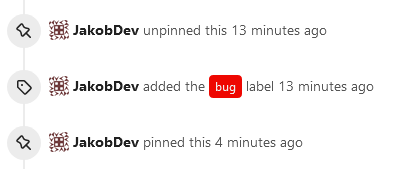
This adds the ability to pin important Issues and Pull Requests. You can
also move pinned Issues around to change their Position. Resolves#2175.
## Screenshots
The Design was mostly copied from the Projects Board.
## Implementation
This uses a new `pin_order` Column in the `issue` table. If the value is
set to 0, the Issue is not pinned. If it's set to a bigger value, the
value is the Position. 1 means it's the first pinned Issue, 2 means it's
the second one etc. This is dived into Issues and Pull requests for each
Repo.
## TODO
- [x] You can currently pin as many Issues as you want. Maybe we should
add a Limit, which is configurable. GitHub uses 3, but I prefer 6, as
this is better for bigger Projects, but I'm open for suggestions.
- [x] Pin and Unpin events need to be added to the Issue history.
- [x] Tests
- [x] Migration
**The feature itself is currently fully working, so tester who may find
weird edge cases are very welcome!**
---------
Co-authored-by: silverwind <me@silverwind.io>
Co-authored-by: Giteabot <teabot@gitea.io>
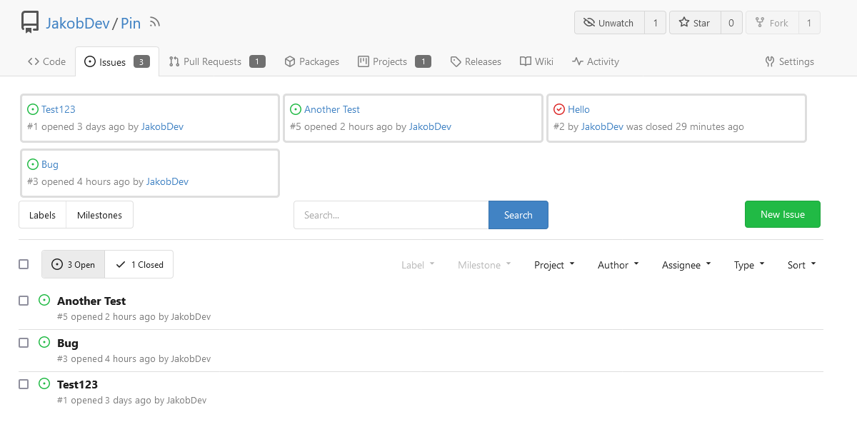
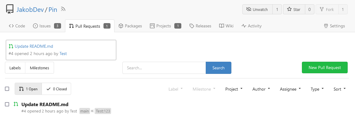
- Replace `<table>` with flexbox
- Add issue modification time and issue number
- Remove big title
- Replace tabs with menu items
- Add clicked item deletion on back button cache restoration

---------

Co-authored-by: wxiaoguang <wxiaoguang@gmail.com>
- Various color tweaks
- Add sticky positioning to left sidebar, right header and right step
header
- Adjust margins and border radiuses
<img width="1235" alt="Screenshot 2023-05-23 at 11 18 06"
src="f601b00d-c7f2-43de-89f2-3ac55f2d9cdc">
<img width="1239" alt="Screenshot 2023-05-23 at 11 18 18"
src="a2d24cc9-29fa-4c17-906b-84feea14b889">


---------
Co-authored-by: yp05327 <576951401@qq.com>
Fixes: https://github.com/go-gitea/gitea/issues/24850

Not sure how to do it for asian fonts only, so let's revert to previous
value for now.

### Before
<img width="414" alt="Screenshot 2023-05-22 at 10 34 10"
src="749f1556-a5cf-48fe-8b10-8dc447221657">

### After
<img width="416" alt="Screenshot 2023-05-22 at 10 34 04"
src="a0a315bb-d95f-4d03-863e-0534f665ca71">
Close#24625
Main changes:
1. For the left panel, show rerun icon only on hover, and add style when
the job is selected, and removed icon on the "rerun all" button and
modify the text on the button
cc437a17-d2e9-4f1b-a8cf-f56e53962767
2. Adjust fonts, and add on hover effects to the log lines. And add
loading effect when the job is done and the job step log is expanded for
the first time. (With reference to github)
2808d77d-f402-4fb0-8819-7aa0a018cf0c
3. Add `gt-ellipsis` to `step-summary-msg` and `job-brief-name`
<img width="898" alt="ellipsis"
src="e2fb7049-3125-4252-970d-15b0751febc7">
4. Fixed
https://github.com/go-gitea/gitea/issues/24625#issuecomment-1541380010
by adding explicit conditions to `ActionRunStatus.vue` and `status.tmpl`
5. Adjust some css styles
---------
Co-authored-by: silverwind <me@silverwind.io>
There was some recent discussion about this in Discord `ui-design`
channel and the conclusion was that
https://github.com/go-gitea/gitea/issues/24305 should have fixed their
OS font installation to have semibold weights.

I have now tested this 601 weight on a Windows 10 machine on Firefox
myself, and I immediately noticed that bold was excessivly bold and
rendering as 700 because browsers are biased towards bolder fonts. So
revert this back to the previous value.
This change makes the CSS for `<video>` in markup match that of `<img>`,
and also allows additional attributes to be used. This way the width,
padding, alignment should work equally well for both.
Visually, nothing should have changed.
Changes include
- Convert most `<a [no href]>` to `<button>` when (re-)viewing files:
- `<a [no href]>` are, by HTML definition, not a link and hence cannot
be focused
- `<a class="ui button">` can now be clicked (again?) using
<kbd>Enter</kbd>
- Previously, the installed keypress handler on `.ui.button` elements
disabled it for links somehow
- The `(un)escape file`, the `expand section` and the `expand/collapse
file` buttons can now be focused (and subsequently clicked using only
the keyboard)
- You can now press <kbd>Space</kbd> on a focused `View file` checkbox
to mark the file as viewed.
- previously, this was impossible as this checkbox listened on the wrong
event listener

The `add code comment` button has been left inaccessible for now as it
requires quite a bit of extra logic so that it is unhidden when it is
focused (you can otherwise focus it without seeing it as you are not
hovering on the corresponding line).

---------

Co-authored-by: silverwind <me@silverwind.io>