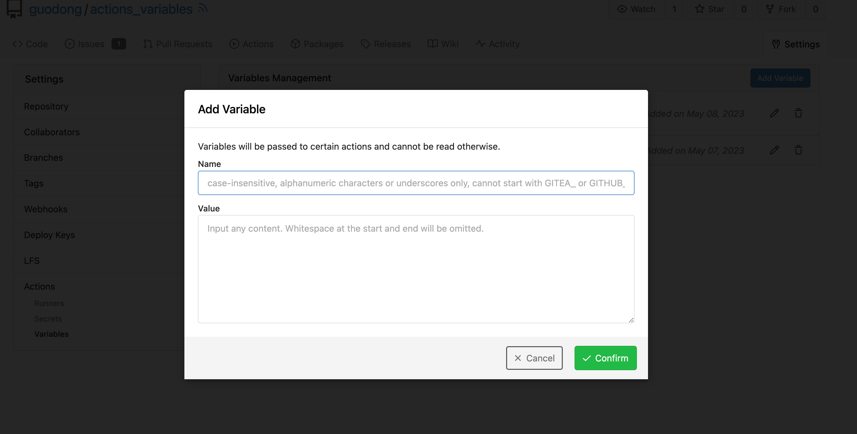
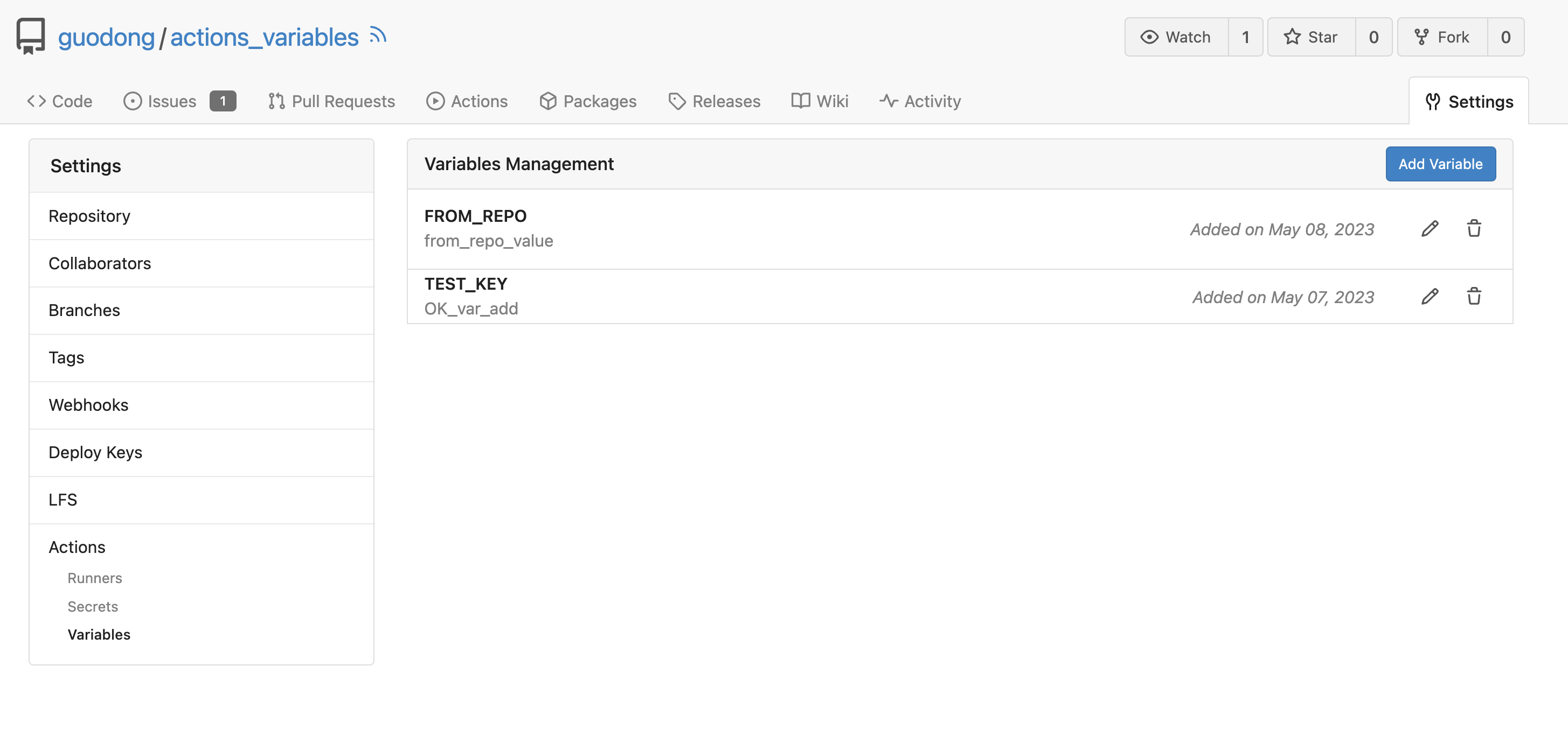
1. Use `gt-invisible` instead of `invisible`.
2. Use `gt-word-break` instead of `dont-break-out` (there is a slight
different "hyphens", but I think it won't affect too much since it is
only used for the "full name").
3. Remove `.small.button:has(svg)` , now our buttons could layout SVG
correctly, and actually I didn't see this CSS class is used in code.
Replace Fomantic `loader` CSS module with our existing `is-loading`
spinner. Only three places in the UI used this module, which are
pictured here:

imagediff:
<img width="1237" alt="Screenshot 2023-08-22 at 22 18 01"
src="b0d82531-f05e-43c6-9e5b-1bfc268c056d">

webauthn:
<img width="894" alt="Screenshot 2023-08-22 at 22 05 05"
src="7b583425-d944-474a-a57a-22a65bbd8b29">

heatmap (I removed the previous loading text, it was unreadable because
it was tiny and on fast machines only visible for a fraction of a
second):
<img width="764" alt="Screenshot 2023-08-22 at 22 18 44"
src="1c7472d6-3e17-4224-a992-d8c0b380cc73">

Also, heatmap container does not resize any more after loading now and
previous duplicate id `user-heatmap` is gone.

---------

Co-authored-by: wxiaoguang <wxiaoguang@gmail.com>
Focus the editor when clicking the "Write" tab. Works for both Textarea
and EasyMDE. Does for some reason not work without the
`requestAnimationFrame`.
The "btn-octicon is-loading" was introduced by #21842 , it is only used
by the "Copy Content" button, but the "btn-octicon" selector would
affect too many uncertain elements.

Now there is a general "small-loading-icon" class, so the "btn-octicon
is-loading" could be removed.
1. Use `is-loading` instead of `ui loader`
2. Introduce class name `image-diff-tabs`, instead of searching `gt-hidden`, which is fragile
3. Align the UI elements, see the screenshots.
Now Gitea exposes unhandled promise rejection messages as error message on the UI.

The "comment form" was quite unclear before, so it should be handled more gracefully to avoid such error.
In GitHub, we can not rerun jobs if the workflow is disabled.

---------

Co-authored-by: silverwind <me@silverwind.io>
Co-authored-by: wxiaoguang <wxiaoguang@gmail.com>
## Archived labels
This adds the structure to allow for archived labels.
Archived labels are, just like closed milestones or projects, a medium to hide information without deleting it.
It is especially useful if there are outdated labels that should no longer be used without deleting the label entirely.
## Changes
1. UI and API have been equipped with the support to mark a label as archived
2. The time when a label has been archived will be stored in the DB
## Outsourced for the future
There's no special handling for archived labels at the moment.
This will be done in the future.
## Screenshots


Part of https://github.com/go-gitea/gitea/issues/25237
---------
Co-authored-by: delvh <dev.lh@web.de>
Co-authored-by: wxiaoguang <wxiaoguang@gmail.com>
This PR refactors a bunch of projects-related code, mostly the
templates.
The following things were done:
- rename boards to columns in frontend code
- use the new `ctx.Locale.Tr` method
- cleanup template, remove useless newlines, classes, comments
- merge org-/user and repo level project template together
- move "new column" button into project toolbar
- move issue card (shared by projects and pinned issues) to shared
template, remove useless duplicated styles
- add search function to projects (to make the layout more similar to
milestones list where it is inherited from 😆)
- maybe more changes I forgot I've done 😆Closes#24893
After:


---------
Co-authored-by: silverwind <me@silverwind.io>
fixed#26156
* Added a retry button in the frontend (only displayed when the status
is abnormal)
* After clicking Retry, the backend adds the task back to the task queue


---------
Co-authored-by: wxiaoguang <wxiaoguang@gmail.com>
Resizing the comment editor can be a very expensive operation because it
triggers page reflows, which on large PRs can take upwards of seconds to
complete. Disable this mechanism on the diff page only where we know
that the page can get large.

Fixes https://github.com/go-gitea/gitea/issues/26201 for the textarea
editor.

I don't think this can be fixed for EasyMDE because as far as I can
tell, it exposes no option to disable this resizing.

---------

Co-authored-by: Giteabot <teabot@gitea.io>
Fixes: https://github.com/go-gitea/gitea/issues/26202

Actually later I found out the code did not use `clippie`, so I fixed
it. The bug was never in the clippie module like I initially suspected.
Also, I added a tooltip for feedback.

<img width="139" alt="image"
src="da501670-9c15-4412-969a-b559773c7ab9">

---------

Co-authored-by: Giteabot <teabot@gitea.io>
This PR adds a new dropdown to select a commit or a commit range
(shift-click like github) of a Pull Request.
After selection of a commit only the changes of this commit will be shown.
When selecting a range of commits the diff of this range is shown.
This allows to review a PR commit by commit or by viewing only commit ranges.
The "Show changes since your last review" mechanism github uses is implemented, too.
When reviewing a single commit or a commit range the "Viewed" functionality is disabled.
## Screenshots
### The commit dropdown

### Selecting a commit range

### Show changes of a single commit only

### Show changes of a commit range

Fixes https://github.com/go-gitea/gitea/issues/20989
Fixes https://github.com/go-gitea/gitea/issues/19263
---------
Co-authored-by: silverwind <me@silverwind.io>
Co-authored-by: KN4CK3R <admin@oldschoolhack.me>
Co-authored-by: wxiaoguang <wxiaoguang@gmail.com>
Co-authored-by: delvh <dev.lh@web.de>
Now, you can see for a commit which existing branches and tags contain it.
You first have to click on the `load branches and tags` button, they are not preloaded by default.
All branches and tags are ordered descending by creation date.
You can even see without much hassle if the given commit is already part of the default branch.
Closes#25152
## Screenshots
### Initial

### Loaded

---------
Co-authored-by: silverwind <me@silverwind.io>
Co-authored-by: wxiaoguang <wxiaoguang@gmail.com>
Since OAuth2 will callback the root URL, if the user starts signing in
from a wrong host, Gitea will return 500 because it cannot find the
session.

<details>
<summary>How to reproduce</summary>

<img width="901" alt="image"
src="2c2e255c-e13e-4a11-9be7-b226bee54920">

<img width="1014" alt="image"
src="b31cfcf6-a320-483d-9ce5-ba8562f065e1">

</details>


So show the mismatched ROOT_URL warning on the sign-in page if OAuth2 is
enabled.

<img width="1015" alt="image"
src="99e80b17-c790-49a3-bbf2-2bd9396a7daa">
Previously, `sortablejs` was imported twice, once synchronously and once
asynchronously, leading to webpack creating duplicate output code (once
in the index bundle, and once in a separate chunk). Fix this by always
asynchronously importing it. This was one of the build warnings observed
when trying to build with vite.
Fix#25627
1. `ctx.Data["Link"]` should use relative URL but not AppURL
2. The `data-params` is incorrect because it doesn't contain "page". JS
can simply use "window.location.search" to construct the AJAX URL
3. The `data-xxx` and `id` in notification_subscriptions.tmpl were
copied&pasted, they don't have affect.
Monaco can not deal with color formats other than 6-digit hex, so we
convert the colors for it via new
[`tinycolor2`](https://github.com/bgrins/TinyColor) dependency (5kB
minzipped).

Also, with the addition of the module, we can replace the existing
`hexToRGBColor` usage, I verified it is compatible with the current
tests before removing the function.

Fixes: https://github.com/go-gitea/gitea/issues/25770
Changes:
* Rename gt-tl/gt-tc/gt-tr to gt-text-left/gt-text-center/gt-text-right
* The gt-ab and gt-br-0 are removed because they are not needed anymore
* Fix the clone dropdown button padding by ":not(.icon)"
Before:
<details>

</details>
After:
<details>

</details>
Fixes#25758
Co-authored-by: Giteabot <teabot@gitea.io>
Right now when clicking on loadmore on files change page, if the loaded
content is image, it will be always in load status:


39e449b6-067a-474c-9443-9dd98d5bbfe2

This PR fixes this by adding `initImageDiff ` to `onShowMoreFiles `

After:


87bbb13e-0064-4a6e-a7ad-0f0060eb8bff
Should look exactly like before for normal dividers. "Horizontal" ones
look better because they no longer use image backgrounds.

<img width="917" alt="Screenshot 2023-06-27 at 19 07 56"
src="d97d8dec-6859-44a8-85ba-e4549b4dd9df">

<img width="914" alt="Screenshot 2023-06-27 at 19 05 58"
src="8bf98544-2d82-4ebf-ac68-d6dc237bd6b2">

<img width="1246" alt="Screenshot 2023-06-27 at 19 00 42"
src="36a6bb21-6029-4f53-8bee-535f55c66fed">

<img width="344" alt="Screenshot 2023-06-27 at 18 58 15"
src="a9e70aee-8e6b-4ea1-9e93-19c9f96aec6e">
<img width="823" alt="Screenshot 2023-06-27 at 18 56 22"
src="e7a497cd-f262-4683-8872-23c3c8cce32f">

<img width="330" alt="Screenshot 2023-06-27 at 19 21 11"
src="42f24149-a655-4c7e-bd26-8ab52db6446b">
Close#20976Close#20975
1. Fix the bug: the TOC in footer was incorrectly rendered as main
content's TOC
2. Fix the layout: on mobile, the TOC is put above the main content,
while the sidebar is put below the main content
3. Auto collapse the TOC on mobile
ps: many styles of "wiki.css" are moved from old css files, so leave
nits to following PRs.
Fix  #25438

All non-"ok" buttons which do not have "type" should not submit the
form, should not be triggered by "Enter".

Co-authored-by: silverwind <me@silverwind.io>
Co-authored-by: Giteabot <teabot@gitea.io>
We only needs 2 lines to hide the dividers.
```
$dropdownLabelFilter.dropdown('setting', {'hideDividers': 'empty'});
$dropdownLabelFilter.dropdown('refreshItems');
```
Other code blocks are refactored by the way.


A regression of #25210

The `e.target` is not "this", eg: `<button link-action><svg></button>`,
then `this` should be `button` but `e.target` is `svg`.

I will propose a clearer and complete solution for these "link-action"
"show-modal" elements after #24724

Co-authored-by: Giteabot <teabot@gitea.io>
- Update all JS dependencies
- Enable stylint
[`media-feature-name-value-no-unknown`](https://stylelint.io/user-guide/rules/media-feature-name-value-no-unknown)
- Make use of new features in webpack and text-expander-element
- Tested Swagger and Mermaid

To explain the `text-expander-element` change: Before this version, the
element added a unavoidable space after emoji completion. Now that
https://github.com/github/text-expander-element/pull/36 is in, we gain
control over this space and I opted to remove it for emoji completion
and retain it for `@` mentions.

---------

Co-authored-by: Giteabot <teabot@gitea.io>
Follow #23290
Network error won't make content lost. And this is a much better
approach than "loading-button".
The UI is not perfect and there are still some TODOs, they can be done
in following PRs, not a must in this PR's scope.
<details>

</details>
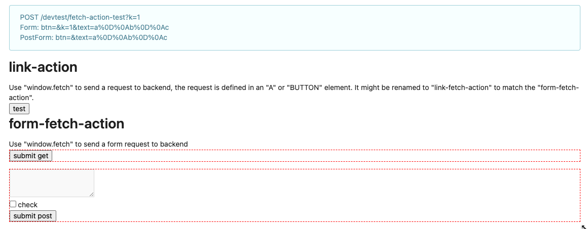
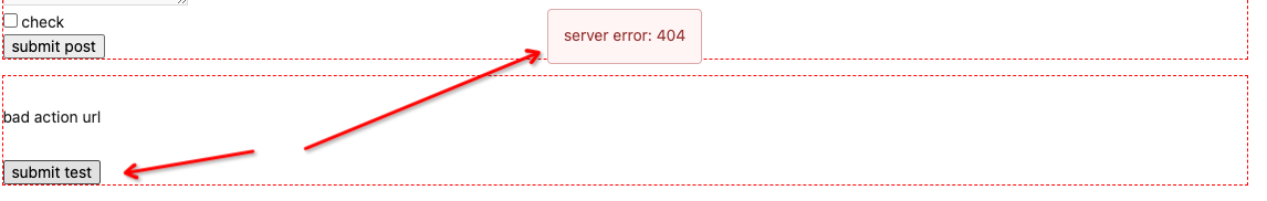
Clarify the "link-action" behavior:

>  // A "link-action" can post AJAX request to its "data-url"
> // Then the browser is redirect to: the "redirect" in response, or
"data-redirect" attribute, or current URL by reloading.

And enhance the "link-action" to support showing a modal dialog for
confirm. A similar general approach could also help PRs like
https://github.com/go-gitea/gitea/pull/22344#discussion_r1062883436

> // If the "link-action" has "data-modal-confirm(-html)" attribute, a
confirm modal dialog will be shown before taking action.


And a lot of duplicate code can be removed now. A good framework design
can help to avoid code copying&pasting.

---------

Co-authored-by: silverwind <me@silverwind.io>
According to my test, the UI (emoji) is fine in Safari

And actually the code is just dead code, because the "resize" event is
never fired on page loading. So for most cases users just view the pages
without this hacky patch, nobody ever complains.