Backport #27916 by @sebastian-sauer
Show the correct sha when viewing a single commit.

Co-authored-by: sebastian-sauer <sauer.sebastian@gmail.com>
Backport #27892 by @earl-warren

- Remove the set tabindex and instead let the browser figure out the
correct tab order.
- Resolves https://codeberg.org/forgejo/forgejo/issues/1626

Co-authored-by: Earl Warren <109468362+earl-warren@users.noreply.github.com>
Co-authored-by: Gusted <postmaster@gusted.xyz>
Co-authored-by: wxiaoguang <wxiaoguang@gmail.com>
Backport #27267 by @silverwind

1. Dropzone attachment removal, pretty simple replacement
2. Image diff: The previous code fetched every image twice, once via
`img[src]` and once via `$.ajax`. Now it's only fetched once and a
second time only when necessary. The image diff code was partially
rewritten.

Co-authored-by: silverwind <me@silverwind.io>
Backport #27322 by @wxiaoguang
Close#26730
1. The `diff-detail-box` was abused, it shouldn't be used for
"DiffFileList/DiffFileTree".
2. Fix the sticky position for various screens.


Co-authored-by: wxiaoguang <wxiaoguang@gmail.com>
Backport #27227 by @denyskon

Throughout the Gitea codebase, you can meet some weird constructions to
make `locale.Tr` work in subtemplates.
Since we now have `ctx.Locale.Tr` which solves that problem, clean up
various templates which pass `locale` through `dict` or use some weird
constructions like `$.root.locale`

Going on, it would be great to replace every case of `$.locale.Tr` and
`.locale.Tr` with `ctx.Locale.Tr`, but that needs to be done with
patience.

Co-authored-by: Denys Konovalov <kontakt@denyskon.de>
I think it's better if the primary actions have primary color instead of
green which fits better into the overall single-color UI design. This PR
currently replaces every green button with primary:

<img width="141" alt="Screenshot 2023-09-16 at 14 07 59"
src="843c1e50-4fb2-4ec6-84ba-0efb9472dcbe">
<img width="161" alt="Screenshot 2023-09-16 at 14 07 51"
src="9442195a-a3b2-4a42-b262-8377d6f5c0d1">

Modal actions now use uncolored/primary instead of previous green/red
colors. I also removed the box-shadow on all basic buttons:

<img width="259" alt="Screenshot 2023-09-16 at 14 16 39"
src="5beea529-127a-44b0-8d4c-afa7b034a490">
<img width="261" alt="Screenshot 2023-09-16 at 14 17 42"
src="4757f7b2-4d46-49bc-a797-38bb28437b88">

The change currently includes the "Merge PR" button, for which we might
want to make an exception to match the icon color there:

<img width="442" alt="Screenshot 2023-09-16 at 14 33 53"
src="993ac1a5-c94d-4895-b76c-0d872181a70b">
Previously, the tooltip for this button was only shown after opening and
closing it once because it was only set after the server response, now
it shows before opening it.
Now, you don't need to be a git expert anymore to know what these
numbers mean.
## Before

## After

or when the mode actually changed:

This PR adds a new dropdown to select a commit or a commit range
(shift-click like github) of a Pull Request.
After selection of a commit only the changes of this commit will be shown.
When selecting a range of commits the diff of this range is shown.
This allows to review a PR commit by commit or by viewing only commit ranges.
The "Show changes since your last review" mechanism github uses is implemented, too.
When reviewing a single commit or a commit range the "Viewed" functionality is disabled.
## Screenshots
### The commit dropdown

### Selecting a commit range

### Show changes of a single commit only

### Show changes of a commit range

Fixes https://github.com/go-gitea/gitea/issues/20989
Fixes https://github.com/go-gitea/gitea/issues/19263
---------
Co-authored-by: silverwind <me@silverwind.io>
Co-authored-by: KN4CK3R <admin@oldschoolhack.me>
Co-authored-by: wxiaoguang <wxiaoguang@gmail.com>
Co-authored-by: delvh <dev.lh@web.de>
gitea allows to create empty PRs.
Currently when you need approvals for a merge, you have to manually add
/files to the url to get to the files tab to approve / reject the PR.
This PR allows to open the files tab via the normal tab / link and then
fixes the layout of the files tab.
**Screenshots:**
Before:

After:

---------
Co-authored-by: silverwind <me@silverwind.io>
Co-authored-by: Giteabot <teabot@gitea.io>
the PullHeadCommitID is not always available when the PR is merged.

Not sure if this is the best solution but in my simple tests it looks
like this fixes the problem - happy to get any feedback.

hopefully fixes https://github.com/go-gitea/gitea/issues/24813
Two small tweaks:

1. Vertically center arrow here when editing a PR:

<img width="405" alt="Screenshot 2023-06-20 at 19 48 49"
src="1d63764d-9fd9-467e-8a8e-9258c06475eb">

2. Use 2-row layout on diff viewed status and show it again on mobile:

<img width="142" alt="Screenshot 2023-06-20 at 19 51 21"
src="3046e782-163c-4f87-910c-a22066de8f1b">

Mobile view:

<img width="370" alt="Screenshot 2023-06-20 at 19 44 40"
src="9cf56347-7323-4d05-99a5-17ad215ee44d">
- Various corrections to button styles, especially secondary
- Remove focus highlight, it's annoying when it stays on button after
press
- Clearly define ghost and link buttons with demos in devtest
- Remove black, grey and tertiary buttons, they should not be used
- Make `arc-green` slightly darker

<img width="1226" alt="image"
src="8d89786a-01ab-40f8-ae5a-e17f40e35084">
<img width="1249" alt="image"
src="83651e6d-3c27-46ff-b8bd-ff344d70e949">

---------

Co-authored-by: wxiaoguang <wxiaoguang@gmail.com>
Co-authored-by: Giteabot <teabot@gitea.io>
Feel free to close this if there isn't interest.
The tree view looks amazing, and all of our users are really enjoying it
(major kudos to developers!), but only IF I tell them it exists!
Essentially, the file tree view as it is effectively undiscoverable.
This PR changes the default state for the tree view to open, which
should significantly help with discoverability.
An alternative could be to reserve more horizontal space, as a typical
accordion panel would look (eg. VS Code), eg.

1. Add this button:

<img width="232" alt="Screenshot 2023-05-29 at 15 21 47"
src="5eaf6bd1-83db-4ffc-9503-eda0c59807d2">
<img width="297" alt="Screenshot 2023-05-29 at 15 20 22"
src="708a344f-f6d7-4229-bfda-76e1571b42c8">

2. Correct `button-link` styles to not have a background hover effect.
3. Tweak `.ui.container` padding to be the same for fluid and non-fluid.

4. Misc enhancements to diff header:

Before:
<img width="984" alt="Screenshot 2023-05-29 at 15 38 53"
src="c7926f6a-bd0a-4b05-97ad-c91fc25c62d5">

After:
<img width="987" alt="Screenshot 2023-05-29 at 15 43 10"
src="0149f545-45f8-42cf-b443-e1c76bd5cdeb">
Follow #21012, #22399
Replace #24983, fix#24938
Help #24956
Now, the `window.config.pageData.diffFileInfo` itself is a reactive
store, so it's quite easy to sync values/states by it, no need to do
"doLoadMoreFiles" or "callback".
Screenshot: these two buttons both work. After complete loading, the UI
is also right.
<details>


</details>
This MR introduces the addition of file mode display support for both
new file creation and file mode changes, following a similar approach as
GitLab.
GitLab:

Gitea:

Replaces: https://github.com/go-gitea/gitea/pull/23159
Closes: https://github.com/go-gitea/gitea/issues/23021
---------
Co-authored-by: silverwind <me@silverwind.io>
Co-authored-by: delvh <dev.lh@web.de>
Co-authored-by: Giteabot <teabot@gitea.io>
There was some recent discussion about this in Discord `ui-design`
channel and the conclusion was that
https://github.com/go-gitea/gitea/issues/24305 should have fixed their
OS font installation to have semibold weights.

I have now tested this 601 weight on a Windows 10 machine on Firefox
myself, and I immediately noticed that bold was excessivly bold and
rendering as 700 because browsers are biased towards bolder fonts. So
revert this back to the previous value.
Visually, nothing should have changed.
Changes include
- Convert most `<a [no href]>` to `<button>` when (re-)viewing files:
- `<a [no href]>` are, by HTML definition, not a link and hence cannot
be focused
- `<a class="ui button">` can now be clicked (again?) using
<kbd>Enter</kbd>
- Previously, the installed keypress handler on `.ui.button` elements
disabled it for links somehow
- The `(un)escape file`, the `expand section` and the `expand/collapse
file` buttons can now be focused (and subsequently clicked using only
the keyboard)
- You can now press <kbd>Space</kbd> on a focused `View file` checkbox
to mark the file as viewed.
- previously, this was impossible as this checkbox listened on the wrong
event listener

The `add code comment` button has been left inaccessible for now as it
requires quite a bit of extra logic so that it is unhidden when it is
focused (you can otherwise focus it without seeing it as you are not
hovering on the corresponding line).

---------

Co-authored-by: silverwind <me@silverwind.io>
Follow:
* #23574
* Remove all ".tooltip[data-content=...]"

Major changes:

* Remove "tooltip" class, use "[data-tooltip-content=...]" instead of
".tooltip[data-content=...]"
* Remove legacy `data-position`, it's dead code since last Fomantic
Tooltip -> Tippy Tooltip refactoring
* Rename reaction attribute from `data-content` to
`data-reaction-content`
* Add comments for some `data-content`: `{{/* used by the form */}}`
* Remove empty "ui" class
* Use "text color" for SVG icons (a few)
Remove `[repository.editor] PREVIEWABLE_FILE_MODES` setting that seemed
like it was intended to support this but did not work. Instead, whenever
viewing a file shows a preview, also have a Preview tab in the file
editor.

Add new `/markup` web and API endpoints with `comment`, `gfm`,
`markdown` and new `file` mode that uses a file path to determine the
renderer.

Remove `/markdown` web endpoint but keep the API for backwards and
GitHub compatibility.

## ⚠️ BREAKING ⚠️

The `[repository.editor] PREVIEWABLE_FILE_MODES` setting was removed.
This setting served no practical purpose and was not working correctly.
Instead a preview tab is always shown in the file editor when supported.

---------

Co-authored-by: zeripath <art27@cantab.net>
Co-authored-by: Lunny Xiao <xiaolunwen@gmail.com>
This improves a lot of accessibility shortcomings.
Every possible instance of `<div class="button">` matching the command
`ag '<[^ab].*?class=.*?[" ]button[ "]' templates/ | grep -v 'dropdown'`
has been converted when possible.
divs with the `dropdown` class and their children were omitted as
1. more analysis must be conducted whether the dropdowns still work as
intended when they are a `button` instead of a `div`.
2. most dropdowns have `div`s as children. The HTML standard disallows
`div`s inside `button`s.
3. When a dropdown child that's part of the displayed text content is
converted to a `button`, the dropdown can be focused twice

Further changes include that all "gitea-managed" buttons with JS code
received an `e.preventDefault()` so that they don't accidentally submit
an underlying form, which would execute instead of cancel the action.
Lastly, some minor issues were fixed as well during the refactoring.

## Future improvements

As mentioned in
https://github.com/go-gitea/gitea/pull/23337#discussion_r1127277391,
`<a>`s without `href` attribute are not focusable.
They should later on be converted to `<button>`s.

---------

Co-authored-by: wxiaoguang <wxiaoguang@gmail.com>
Co-authored-by: silverwind <me@silverwind.io>
Co-authored-by: techknowlogick <techknowlogick@gitea.io>
Co-authored-by: Lunny Xiao <xiaolunwen@gmail.com>
Close#22847
This PR:
* introduce Gitea's own `showElem` and related functions
* remove jQuery show/hide
* remove .hide class
* remove inline style=display:none
From now on:
do not use:
* "[hidden]" attribute: it's too weak, can not be applied to an element
with "display: flex"
* ".hidden" class: it has been polluted by Fomantic UI in many cases
* inline style="display: none": it's difficult to tweak
* jQuery's show/hide/toggle: it can not show/hide elements with
"display: xxx !important"
only use:
* this ".gt-hidden" class
* showElem/hideElem/toggleElem functions in "utils/dom.js"
cc: @silverwind , this is the all-in-one PR
As discussed in #22847 the helpers in helpers.less need to have a
separate prefix as they are causing conflicts with fomantic styles

This will allow us to have the `.gt-hidden { display:none !important; }`
style that is needed to for the reverted PR.

Of note in doing this I have noticed that there was already a conflict
with at least one chroma style which this PR now avoids.

I've also added in the `gt-hidden` style that matches the tailwind one
and switched the code that needed it to use that.

Signed-off-by: Andrew Thornton <art27@cantab.net>

---------

Signed-off-by: Andrew Thornton <art27@cantab.net>
Co-authored-by: wxiaoguang <wxiaoguang@gmail.com>
partially fix#19345
This PR add some `Link` methods for different objects. The `Link`
methods are not different from `HTMLURL`, they are lack of the absolute
URL. And most of UI `HTMLURL` have been replaced to `Link` so that users
can visit them from a different domain or IP.
This PR also introduces a new javascript configuration
`window.config.reqAppUrl` which is different from `appUrl` which is
still an absolute url but the domain has been replaced to the current
requested domain.
There was a serious regression in #21012 which broke the Show More
button on the diff page, and the show more button was also broken on the
file tree too.
This PR fixes this by resetting the pageData.diffFiles as the vue
watched value and reattachs a function to the show more button outside
of the file tree view.
Fix#22380
Signed-off-by: Andrew Thornton <art27@cantab.net>
Co-authored-by: John Olheiser <john.olheiser@gmail.com>
Co-authored-by: Lunny Xiao <xiaolunwen@gmail.com>
This PR adds a filetree to the left side of the files/diff view.
Initially the filetree will not be shown and may be shown via a new
"Show file tree" button.
Showing and hiding is using the same icon as github. Folders are
collapsible. On small devices (max-width 991 PX) the file tree will be
hidden.
Close#18192
Co-authored-by: wxiaoguang <wxiaoguang@gmail.com>
The problem was that many PR review components loaded by `Show more`
received the same ID as previous batches, which confuses browsers (when
clicked). All such occurrences should now be fixed.
Additionally improved the background of the `viewed` checkbox.
Lastly, the `go-licenses.json` was automatically updated.
Fixes#21228.
Fixes#20681.
Co-authored-by: wxiaoguang <wxiaoguang@gmail.com>
Fixes#21184
Regression of #19552
Instead of using `GetBlobByPath` I use the already existing instances.
We need more information from #19530 if that error is still present.
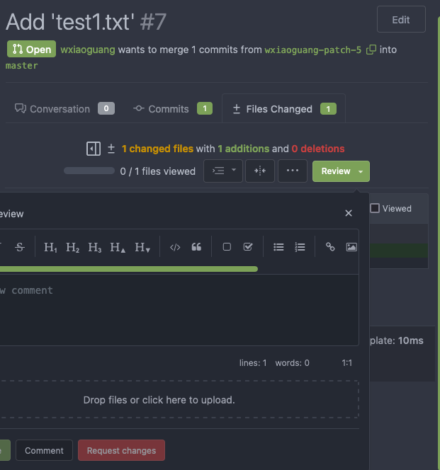
The layout on the review code view was broken depending on length of the text. Change all three buttons to icons with tooltip to make more space for these long texts.

Fixes: #20922
* Refactor `i18n` to `locale`

- Currently we're using the `i18n` variable naming for the `locale`
struct. This contains locale's specific information and cannot be used
for general i18n purpose, therefore refactoring it to `locale` makes
more sense.
- Ref: https://github.com/go-gitea/gitea/pull/20096#discussion_r906699200

* Update routers/install/install.go
Replace the only `<meter>` element in use with a `<progress>` which is
styled properly. Also slightly adjust colors on it for better contrast.

Co-authored-by: Lunny Xiao <xiaolunwen@gmail.com>
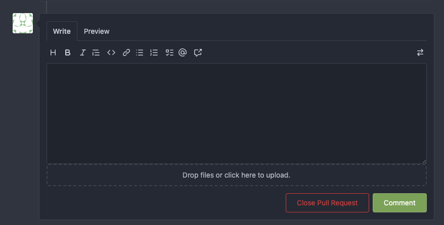
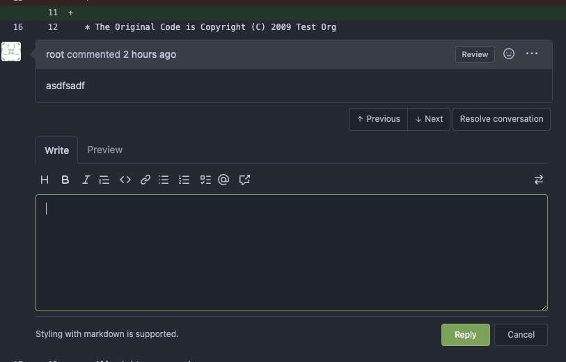
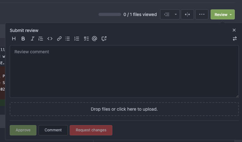
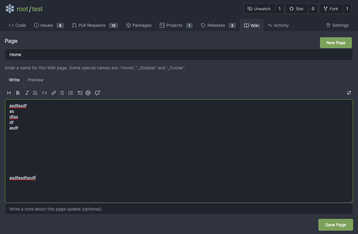
* Make Ctrl+Enter (quick submit) work for issue comment and wiki editor

* Remove the required `SubmitReviewForm.Type`, empty type (triggered by quick submit) means "comment"

* Merge duplicate code